Learning Tables | FlexBox Part 1 | How to build navbars. Drop your notes and doubts here.
1 Like


What we have learnt yesterday
- Learned more about
display: inline;anddisplay:block;as a quick revision for flex box. There we have seen a problem.
There we have seen a behaviour of CSS-
For the below code-
<style>
  .child {
    background-color: red;
    height: 100px;
    width: 100px;
    display: block;
  }
</style>
<div id="parent">
  <div class="child">
  </div>

  <div class="child">
  </div>
</div>
Output was-
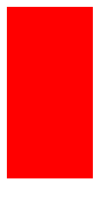
2 collided divs with each of height: 100px; width:100px;
Then we changed the display of child div from block to inline-
Output was-

We didn’t got any output at all. Both red boxes are gone  . Why this is happening, why our browser is not able to output anything after seting display to
 display: inline; ?
Answer is-
CSS has a restriction. For any inline element, we can’t give it width and height because if we can give the height and width to the inline element, it will violate one important property of inline element. The property of inline element says it will take the height and width of the content.
Reference- Inline Properties
Since both of our child divs don’t have any content, hence it is looking like nothing is in output. But, let’s say if we give some content to the child div. Let’s see the output-
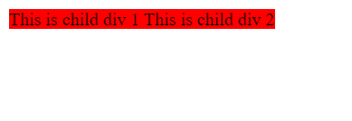
Code used for above output-
<style>
  .child {
    background-color: red;
    height: 100px;
    width: 100px;
    display: inline;
  }
</style>
<div id="parent">
  <div class="child">
    This is child div 1
  </div>

  <div class="child">
    This is child div 2
  </div>
</div>
- For the above case, we can also use
display: inline-blockto get the below results-
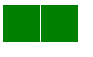
Above property is used to make inline element to set height and width.
3 . Then we have learned about flexbox and it’s properties-
- The
flex-directionproperty defines in which direction the container wants to stack the flex items. - The
flex-wrapproperty specifies whether the flex items should wrap or not. - The
justify-contentproperty is used to align the flex items. - The
align-itemsproperty is used to align the flex items. - The
align-contentproperty is used to align the flex lines.
- Then we have created the navbar by using flexbox and other CSS properties
Codepen link- https://codepen.io/rhythm_varshney/full/zYmwLoo
1 Like


Today notes 02/05/2023
Two types of elements
InLine & Block elements
A block-level element always starts on a new line and takes up the full width available.
An inline element does not start on a new line and it only takes up as much width as necessary.
The
element is a block-level and is often used as a container for other HTML elements.
Button are by deafault inline elements
Button are by deafault inline elements
FlexBox
The Flexible Box Layout Module, makes it easier to design flexible responsive layout structure without using float or positioning.
Flexbox Elements
To start using the Flexbox model, you need to first define a flex container.
example:
1
2
3
main axis - x axis(horizontal axis)
cross axis - y axis(vertical axis)
flex box can work only with one axis at a time i.e., either horizontal or veertical.
To work on both axis at same time it needs to be used with grids.
By default direction of flex is row.
properties of flex direction:
display flex
.flex-container {
display: flex;
}
flex direction:
The flex-direction property defines in which direction the container wants to stack the flex items.
row
The row value stacks the flex items horizontally (from left to right):
.flex-container {
display: flex;
flex-direction: row;
}
row reverse
The row-reverse value stacks the flex items horizontally (but from right to left):
.flex-container {
display: flex;
flex-direction: row-reverse;
}
column
The column value stacks the flex items vertically (from top to bottom):
.flex-container {
display: flex;
flex-direction: column;
}
column reverse
The column-reverse value stacks the flex items vertically (but from bottom to top):
.flex-container {
display: flex;
flex-direction: column-reverse;
}
flex wrap
The flex-wrap property specifies whether the flex items should wrap or not.
Example:
The wrap value specifies that the flex items will wrap if necessary:
.flex-container {
display: flex;
flex-wrap: wrap;
}
Example:
The nowrap value specifies that the flex items will not wrap (this is default):
.flex-container {
display: flex;
flex-wrap: nowrap;
}
Example:
The wrap-reverse value specifies that the flexible items will wrap if necessary, in reverse order:
.flex-container {
display: flex;
flex-wrap: wrap-reverse;
}
The flex-flow property is a shorthand property for setting both the flex-direction and flex-wrap properties.
Example
.flex-container {
display: flex;
flex-flow: row wrap;
}
justify content
The justify-content property is used to align the flex items:
Example
The center value aligns the flex items at the center of the container:
.flex-container {
display: flex;
justify-content: center;
}
Example
The flex-start value aligns the flex items at the beginning of the container (this is default):
.flex-container {
display: flex;
justify-content: flex-start;
}
Example:
The flex-end value aligns the flex items at the end of the container:
.flex-container {
display: flex;
justify-content: flex-end;
}
Example:
The space-around value displays the flex items with space before, between, and after the lines:
.flex-container {
display: flex;
justify-content: space-around;
}
Example:
The space-between value displays the flex items with space between the lines:
.flex-container {
display: flex;
justify-content: space-between;
}
align items
The align-items property is used to align the flex items.
example:
.flex-container {
display: flex;
height: 200px;
align-items: center;
}
align content
The align-items property is used to align the flex items.
Example
The center value aligns the flex items in the middle of the container:
.flex-container {
display: flex;
height: 200px;
align-items: center;
}
Example
The flex-start value aligns the flex items at the top of the container:
.flex-container {
display: flex;
height: 200px;
align-items: flex-start;
}
Example
The flex-end value aligns the flex items at the bottom of the container:
.flex-container {
display: flex;
height: 200px;
align-items: flex-end;
}
Example
The stretch value stretches the flex items to fill the container (this is default):
.flex-container {
display: flex;
height: 200px;
align-items: stretch;
}
Example
The baseline value aligns the flex items such as their baselines aligns:
.flex-container {
display: flex;
height: 200px;
align-items: baseline;
}
Perfect Centering
In the following example we will solve a very common style problem: perfect centering.
Set both the justify-content and align-items properties to center, and the flex item will be perfectly centered:
Example
.flex-container {
display: flex;
height: 300px;
justify-content: center;
align-items: center;
}
align-content: Modifies the behavior of the flex-wrap property. It is similar to align-items, but instead of aligning flex items, it aligns flex lines.
align-items: Vertically aligns the flex items when the items do not use all available space on the cross-axis.
display: Specifies the type of box used for an HTML element.
flex-direction: Specifies the direction of the flexible items inside a flex container.
flex-flow:A shorthand property for flex-direction and flex-wrap.
flex-wrap:Specifies whether the flex items should wrap or not, if there is not enough room for them on one flex line.
justify-content:Horizontally aligns the flex items when the items do not use all available space on the main-axis.
gap
Definition and Usage
The gap property defines the size of the gap between the rows and between the columns in flexbox, grid or multi-column layout. It is a shorthand for the following properties:
row-gap
column-gap
row-gap: Sets the size of the gap between the rows in a grid or flexbox layout.
column-gap: Sets the size of the gap between the columns in a grid, flexbox or multi-column layout.
initial:Sets this property to its default value.
inherit:Inherits this property from its parent element.
NavBar:
A navigation bar needs standard HTML as a base.
In our examples we will build the navigation bar from a standard HTML list.
A navigation bar is basically a list of links, so using the
- and
- elements makes perfect sense:
Example
Now let’s remove the bullets and the margins and padding from the list:
Example
ul {
list-style-type: none;
margin: 0;
padding: 0;
}Example explained:
list-style-type: none; - Removes the bullets. A navigation bar does not need list markers
Set margin: 0; and padding: 0; to remove browser default settings
The code in the example above is the standard code used in both vertical, and horizontal navigation bars
1 Like
@pathakdivya93 It has everything. It’ll surely help other members too. ( our batch + other batch ) I’m speechless 
1 Like

 I’m sure you will complete all given tasks.